Color Widgets, Theme: iWidgets
- 4.6
- Rating
- 50.00M
- Installs
- Free
- Price
 Analysis by App-foxy
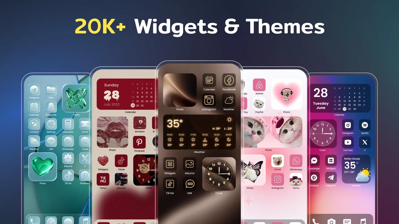
I like home-screen customization when it makes my phone feel more personal without turning setup into a second job. Color Widgets, Theme: iWidgets approaches that idea as a lifestyle app built around custom icons, color widgets, themes, and wallpapers. After spending time with it, my main impression is that the visual results can be appealing, but the experience depends heavily on how carefully you follow the setup steps and how much control your phone’s operating system gives you.
The app is free to install, which makes it easy to try before deciding whether it belongs in your daily setup. It comes from AI Photo Team and is intended for everyone, so the focus is decorative rather than technical or specialized. Its current version is 1.8.0, and it works on devices running Android 8.0 or later. That broad compatibility is useful, although the exact appearance and behavior can still vary between phones.
Where the setup usually becomes confusing
The first thing I noticed is that customizing a home screen is not always a single-tap process. Choosing a design inside the app is only one part of the job. You may also need to place a widget, apply an icon style, change wallpaper, or adjust the arrangement on the home screen itself. When something looks different from the preview, it is tempting to assume the app has failed, but the phone launcher is often involved too.
You May Also Like

 Pandora - Music & Podcasts
Pandora’s Music Is Easy to Start, but Harder to Recover
Pandora’s strength is its low-effort path from a seed to a station. Its weak spot is how much confidence it asks you to place in connection, setup, and quiet recovery.

 8 Ball Pool
 Is Built on Rivalries, Rematches, and Routine
A close look at the rivalries, rematches, shared routines, and unanswered safety questions that turn a quick pool match into a persistent mobile community.

 Samsung Music
’s Quiet Strength Is Playing What You Already Own
Its reach comes less from spectacle than from dependable access to a personal library. That simplicity is both the app’s strongest retention engine and its ceiling.

 AccuWeather: Weather Radar
AccuWeather Review: A Quick, Clear Forecast for Everyday Decisions
For everyday plans, the best forecast is the one you can understand quickly. AccuWeather makes rain timing, radar, and local conditions easy to act on, with a few trade-offs.

 Hill Climb Racing
Why Hill Climb Racing Still Turns Crashes Into One More Run
A tiny car, a bumpy hill and one more upgrade: Hill Climb Racing keeps resurfacing because its simple chaos makes every near-miss feel personal.

 AliExpress - Shopping App
AliExpress Makes Global Shopping Feel Personal, but Shoppers Bear the Risk
AliExpress turns a global marketplace into a pocket-sized discovery engine. Its reach is useful, its shopping loop compelling, and its trade-offs easy to miss.
More From Our News Desk
View All News


This matters especially for people who expect a complete transformation immediately. A theme can look coherent inside the app while the final home screen depends on the launcher, icon support, screen layout, and the way widgets are added. I found it more helpful to treat each customization as a small project: select one visual direction, apply it carefully, then check the result before adding another layer.
The app’s strongest appeal is visual consistency. A matching widget, wallpaper, and icon treatment can make a basic home screen feel deliberately designed. The weaker side is that the process can feel less automatic than the polished previews suggest. If you prefer a launcher that changes everything through one system-wide switch, this may not be the most convenient route.
Another common sticking point is choosing a widget without considering available space. A widget may need a particular area on the home screen, and a crowded layout can leave no suitable place for it. I recommend moving rarely used shortcuts to another page before starting. This prevents the frustrating cycle of repeatedly rearranging icons just to make one design fit.
The best results come from treating the home screen as a layout, not just a collection of pictures. I first decide where I want the main widget, then leave enough room around it for the visual balance to work. Only after that do I adjust icons and wallpaper. This order saves time and makes it easier to identify which part of the setup is causing trouble.
What I check before changing the whole phone
I usually begin with a single page rather than replacing every screen. That gives me a low-risk test of the app’s style and of my phone’s compatibility with the selected design. If the widget appears correctly and the icons remain usable, I can continue. If the result feels too busy or something fails to appear, I have not disrupted my entire routine.
This gradual approach is also useful for people who rely on muscle memory. A dramatic icon change can make familiar apps harder to find, even when the new design looks attractive. I prefer keeping my most-used apps in their usual positions and applying the visual changes around them. The home screen then feels refreshed without becoming confusing.
Before applying a wallpaper, I check whether it leaves enough contrast for labels and icons. A beautiful background can reduce readability if it is too detailed or too close in color to the rest of the interface. In practice, a simpler wallpaper often makes the widget and icons stand out better than a highly decorative one.
Setup checks that prevent avoidable problems
When a widget does not appear, I check the home screen first rather than repeatedly tapping the same option in the app. I make sure I am editing the home screen, look for the widget option, and confirm that there is enough open space. The exact wording and placement of these controls can differ between Android phones, so I follow the phone’s own home-screen controls instead of assuming every device behaves identically.
I also check whether the app is fully installed and opened normally before attempting customization. If the phone is busy, storage is nearly full, or the app has not finished loading its visual content, an action may appear unresponsive. Closing the app, reopening it, and trying one change at a time is a sensible first recovery step.
For a clean test, I avoid changing several things at once. I select a widget, place it, and inspect it. Then I try the icons. Finally, I consider the wallpaper. This sequence tells me whether an issue belongs to the widget placement, the icon change, or the overall home-screen arrangement.
It is also worth checking the device’s Android version before investing time in a full redesign. The app supports Android 8.0 and newer, but supported operating-system versions do not guarantee identical launcher behavior on every model. Manufacturer interfaces can add their own rules around home-screen editing, icon appearance, and widget placement.
One practical tip is to take a quick screenshot of your current home screen before experimenting. That is not a feature of the app; it is simply a sensible backup of your arrangement. If the new layout does not suit you, you can use the screenshot as a reference while restoring your familiar positions.
How I recover when a change does not stick
When a selected design does not appear immediately, I avoid making repeated changes because that can make it harder to tell what happened. I return to the home screen, check whether the item was actually placed, and then reopen the app only if necessary. A single, controlled retry is more useful than applying several themes in quick succession.
If a widget is present but looks misplaced, I resize or reposition it through the home screen rather than searching for another design straight away. The issue may be spacing, not the design itself. Moving it to a less crowded area can improve the result without starting over.
For icons, I judge the practical result as well as the appearance. If the new style makes an important app difficult to recognize, I keep the original shortcut or reserve the themed arrangement for a secondary page. This is one of the trade-offs of decorative customization: a more uniform screen may be less immediately familiar.
If the app appears stuck, my basic recovery order is simple. I leave the current screen, close and reopen the app, confirm that the phone has enough free space for normal operation, and retry with one item. If the problem only happens on one home-screen page, I test another page. If it happens everywhere, I compare the behavior with the phone’s standard widget controls.
That comparison is valuable because it separates an app issue from a launcher issue. If ordinary widgets also fail to appear, the home-screen environment is the more likely source of the problem. If standard widgets work but one selected design does not, then I focus my troubleshooting on that particular customization instead of changing unrelated phone settings.
When the app is not the cause
Android phones do not all handle home-screen customization in the same way. The manufacturer’s interface, the selected launcher, and the device’s layout rules can affect how a widget is added or how icons are displayed. This means a result that works smoothly on one phone may require extra positioning or a different arrangement on another.
I would not judge the app solely by a mismatch between its preview and one particular launcher. The more useful question is whether the final design can be made attractive and usable on your device. If the answer is yes after a small amount of adjustment, the friction is manageable. If every change requires fighting the launcher, the app may not be worth the effort for your routine.
There is also a difference between a visual theme and a complete replacement of the phone interface. This app is a good fit if you want to decorate the home screen with coordinated elements. It is less suitable if you want deep control over system menus, notification panels, app drawers, or every icon throughout the device. Those needs are usually better served by a launcher or a broader system customization tool.
Battery and performance expectations should be realistic too. A wallpaper is not the same as a full launcher replacement, and a widget may behave differently from a static shortcut. I pay attention to whether the home screen remains responsive and whether the chosen layout still feels convenient after a day of normal use. A design that looks good for five minutes is not automatically a good daily setup.
Privacy-conscious users may also want to review the app’s access requests and their phone’s permission controls before continuing. I do this with any customization app, not because this one is necessarily unusual, but because it is good practice to understand what an app is asking to use. If a permission does not make sense for the action I am trying to perform, I pause rather than approving everything automatically.
Everyday uses beyond making the screen look pretty
One useful scenario is a temporary work setup. I can create a calmer page with a restrained wallpaper, a prominent widget, and only the shortcuts I need during the day. When I am finished, I can return to my usual page instead of allowing work-related apps to dominate the entire phone.
Another practical use is organizing a shared visual mood for a new phone or a seasonal refresh. Rather than hunting for separate wallpapers and unrelated icon packs, I can start with one theme direction and build around it. The advantage is not just appearance; it reduces the number of design decisions I have to make.
I also think the app can help people who enjoy changing their environment but do not want to learn a complex launcher. The controls are easier to approach when the goal is visual decoration. However, that simplicity has limits. Users who want precise grids, extensive gesture controls, or highly technical automation may quickly outgrow this kind of tool.
A less obvious trade-off is maintenance. Once a home screen has been carefully arranged, installing new apps or changing the phone’s default layout can disturb the balance. I recommend leaving a little empty space and avoiding an arrangement that depends on every icon staying in one exact position. A flexible design is easier to keep attractive over time.
Free access and the point where expectations change
The app is free, so trying its basic visual approach does not require an upfront purchase. It also includes optional in-app purchases ranging from $1.49 to $29.99 per item. I would explore the free experience first and decide whether the available designs fit my taste before paying for anything.
That price range makes it especially important to understand what you are buying at the moment of purchase. I would read each purchase screen carefully, confirm the item selected, and avoid assuming that one payment automatically covers every future customization. This is a general buying habit, but it matters here because the app’s value depends strongly on how often you actually change your home screen.
For someone who enjoys regular visual refreshes, optional purchases may feel reasonable. For someone who wants one permanent setup and rarely changes it, paying for additional design material may offer less value. The free starting point is therefore a genuine advantage, because it lets you test your own habits rather than relying on screenshots.
How it compares with the usual alternatives
Compared with using only the phone’s built-in wallpaper and widget tools, Color Widgets, Theme: iWidgets offers a more coordinated starting point. The standard tools are often better for quick, practical changes, while this app is more appealing when you want the screen to feel intentionally styled.
Compared with a full launcher, it is a lighter commitment. A launcher can change navigation, app drawers, gestures, grids, and other parts of the interface, but it may take longer to learn and maintain. This app makes more sense for someone who wants a decorative layer without rebuilding the entire way the phone works.
Compared with assembling separate icon packs, wallpaper apps, and widget tools, the main benefit is convenience. A unified visual direction can save time. The compromise is that a specialized standalone tool may offer deeper control in one area, such as icon editing or advanced widget design. I would choose this app for a balanced, approachable makeover rather than maximum customization depth.
Who should use it and who should skip it
I would recommend it to people who enjoy personalizing their phone, want coordinated home-screen elements, and are comfortable spending a few minutes arranging the final layout. It is particularly suitable for a first customization project because the visual goal is easy to understand: make the screen more colorful, themed, and personal.
I would be more cautious if you depend on a very specific launcher workflow, dislike rearranging shortcuts, or need every icon to remain instantly recognizable. The app may also disappoint users expecting a complete operating-system makeover rather than home-screen decoration.
The public response suggests that many people find the concept appealing: it holds a 4.6 average from around 482 thousand ratings, with roughly 2.9 thousand written reviews and over 10 million installs. Those figures do not remove the launcher-related friction, but they do show that the app has reached a substantial audience. I see that as a reason to try it, not as a guarantee that every phone will produce the same result.
My practical verdict after using it
Color Widgets, Theme: iWidgets succeeds when I use it as a focused visual toolkit rather than expecting it to replace my phone’s entire interface. The strongest experience comes from choosing one design direction, preparing the home screen, and applying changes in a controlled order. That approach keeps the process manageable and makes troubleshooting much easier.
Its main weakness is the gap between selecting a design and getting a polished result on the actual device. Launcher behavior, available space, icon recognition, and personal habits all matter. I would not install it for a completely effortless transformation, but I would install it for an approachable way to make a familiar phone feel new.
For an everyday user, my advice is to start with one page, test one widget, and keep your original layout in mind before changing everything. If the first page feels useful after normal use, continue. If it looks attractive but slows you down, simplify it rather than forcing the theme.
Overall, I think this is a worthwhile free lifestyle app for people who value visual personality more than deep technical control. The optional purchases mean I would explore before spending, and the setup requires patience on some devices. Still, when the theme, wallpaper, widget, and shortcuts work together, the result can be a genuinely pleasant home screen that feels like yours.
FAQs for Color Widgets, Theme: iWidgets
01What is Color Widgets, Theme: iWidgets?
Color Widgets, Theme: iWidgets is a customization app that allows users to personalize their iOS home screens with a variety of widgets, themes, and icons. It offers a wide selection of pre-designed widgets that can display time, date, battery level, and other useful information. Users can also customize the appearance of these widgets to match their personal style.
02How user-friendly is Color Widgets, Theme: iWidgets?
Color Widgets is designed to be user-friendly, with a straightforward interface that allows even beginners to easily navigate through its features. The app provides step-by-step instructions for setting up widgets, making it accessible for users who may not be familiar with customizing their home screens. The drag-and-drop functionality simplifies the process of adding and arranging widgets.
03Is Color Widgets, Theme: iWidgets free to use?
Color Widgets offers a free version with access to a variety of basic widgets and themes. However, for users looking for a more extensive selection and advanced customization options, there is a premium version available for purchase. The premium version typically includes additional features, exclusive widgets, and ad-free usage.
04Does Color Widgets, Theme: iWidgets affect device performance?
Color Widgets is optimized to have minimal impact on device performance. While adding multiple widgets can slightly increase battery usage, the app is designed to run efficiently in the background. Users generally report that any impact on performance is negligible, ensuring a smooth user experience.
05Can Color Widgets, Theme: iWidgets be used on all iOS devices?
Color Widgets is compatible with most iOS devices running iOS 14 or later. The app takes advantage of the widget functionality introduced in iOS 14, so it is not available for earlier versions. Users should ensure their device is updated to the latest iOS version to fully utilize all features of the app.
Pros
- Highly customizable widgets for personalization.
- User-friendly interface simplifies setup.
- Extensive library of themes and styles.
- Regular updates with new features.
- Compatible with both Android and iOS.
Cons
- Limited free features; in-app purchases required.
- Some themes may drain battery quickly.
- Occasional bugs with widget placement.
- Requires internet connection for updates.
- Ads can be intrusive in free version.

Color Widgets, Theme: iWidgets
Gallery